Warp & Weft
Brand identity for a residential property development in Manchester’s bohemian Northern Quarter

Created at
Transmission
Deliverables
Naming / Brand identity / Website / Brochure / Social media / Site hoardings / Art direction / Photography
Project
Warp & Weft
Sector
Property
Project information

Background
Cole Waterhouse is one of the UK's leading real estate development investment and management companies delivering high-quality residential mixed-use and build-to-rent developments across major cities. Following the acquisition of a historic site in Manchester's Northern Quarter I was commissioned to create the development's name brand strategy visual identity and marketing assets. The brief was to craft a distinctive property brand that respected the site's industrial heritage while appealing to a contemporary urban audience.

The creative challenge
The development occupied the site of former eighteenth-century weavers' cottages where as much of the original architecture as possible would be retained and restored. The challenge was to create a memorable residential brand that celebrated the site's rich history without feeling nostalgic or predictable. It needed to attract prospective buyers and investors while positioning the development as an authentic part of the Northern Quarter connecting its industrial past with the lifestyle aspirations of modern city living.


Creativity with character
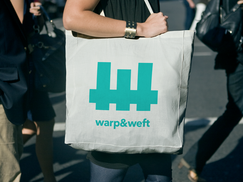
The strongest brands are rooted in genuine stories so I immersed myself in the history of the site before putting pen to paper. Research into Manchester's textile industry uncovered the weaving terms warp and weft the two essential threads that form every woven fabric. The name immediately resonated. It not only acknowledged the site's origins but also became a powerful metaphor for community craftsmanship and belonging with future residents becoming part of the fabric of the neighbourhood.
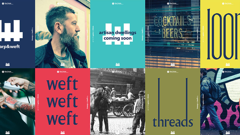
That central idea shaped every aspect of the brand identity from the woven-inspired marque and typography to the verbal language photography and marketing campaign. Rather than creating a brand that could exist anywhere I created one that could only belong here a distinctive identity woven from the history character and culture of Manchester itself.